

Using Wallpaper, stencils, and paint are all effective ways to create a mood and a desired visual effect in a room. Today’s wall treatments offer a wide variety of patterns, colors, and textures. So many choices!! In today’s post, we will discuss the following factors for choosing wall treatment options: Style, Size, Tempo, Visual Effects, and Pattern.
After removing dated wallpaper from several rooms, we were happy to have bright, warm white walls in all of our spaces. Just as we did, take your time when considering a new wall treatment. It is a good idea to search Pinterest, Houzz, and Interior Design Groups on Facebook for lots of inspiration. You should also create a Pinterest Board and Houzz Ideabook full of your wall treatment ideas.
Style
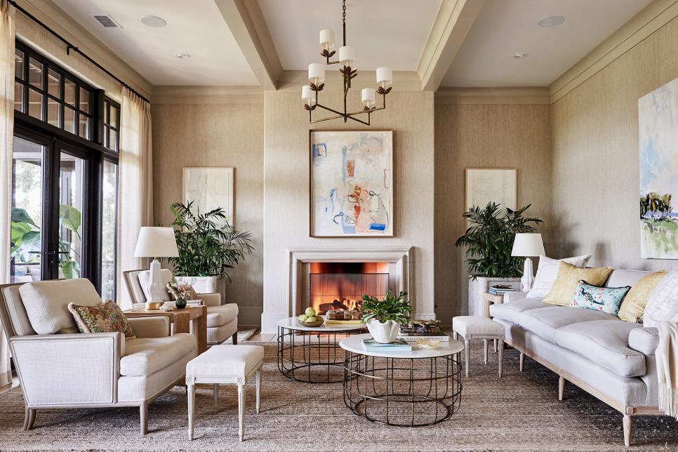
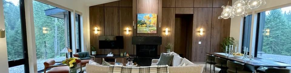
Your starting point for any wall treatment should be the architecture and style of your home. Do you wish to stick with the farmhouse style, or do you want to go bold and against the architectural type? Over the last year we have infused Coastal Modern design into our 1980’s beachside townhouse. Adding textures, calm neutrals, and pops of blue, as well as furniture with clean lines combined these styles beautifully.
Visit the link below to develop your design eye!
Size
When trying to form an impression of a pattern, it’s important to imagine the effect the pattern will have across the entire wall. A small-scale pattern will merge together at a distance and help to create a calm background for any object placed in front of it. A large-scale pattern can overwhelm, so you will need bolder pieces to create balance in the space. We are choosing a bold pattern in neutral colors for the feature wall in our living room.
Tempo
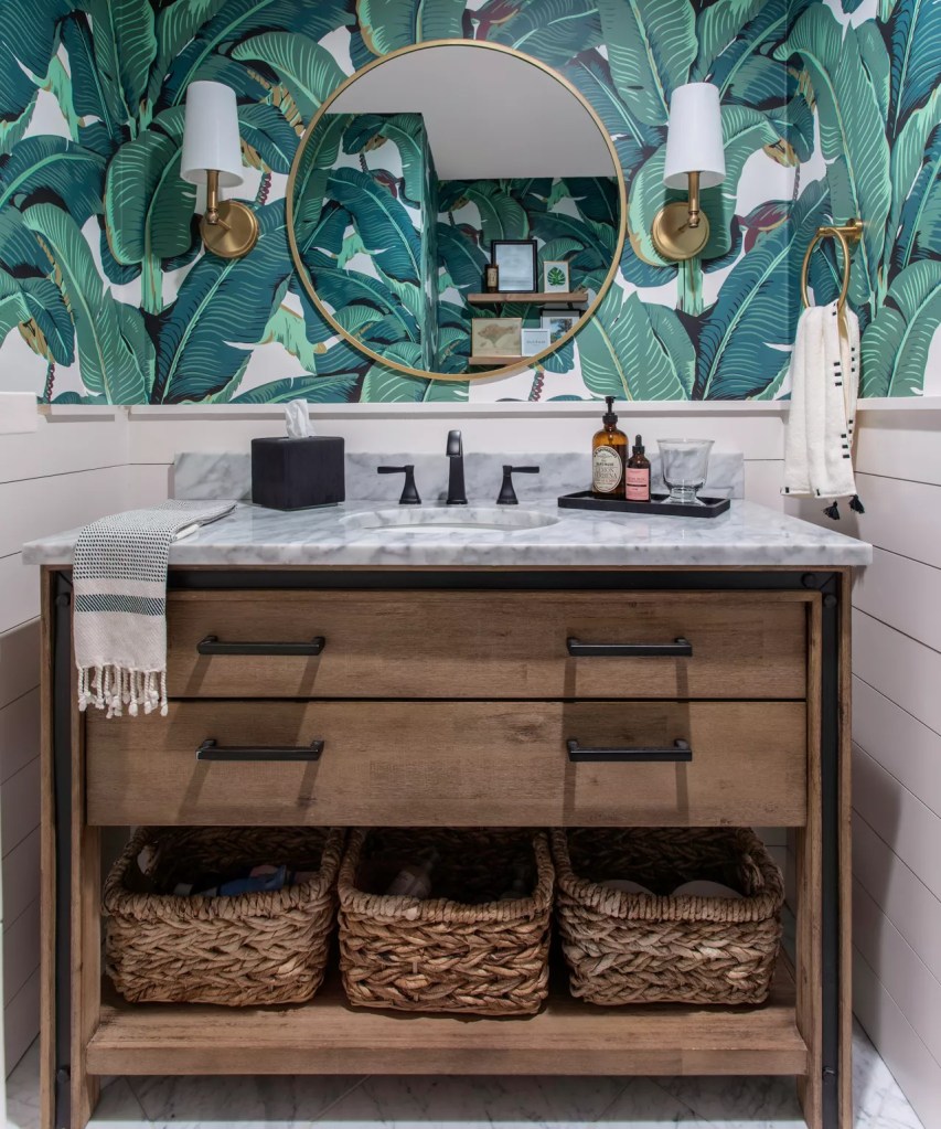
It is a good idea to consciously think about the overall visual tempo in your home. Do you want the space to feel calm or energized? To begin, start with a small space and decide what tempo you would like to set, for example, hang your chosen wallpaper behind the vanity in a powder room. To create a calm tempo, use monochromatic colors and transition a strongly patterned wall into a calming, single color wall. If you want a bit more drama, consider choosing two or three complementary patterns from a single wallpaper designer’s portfolio.
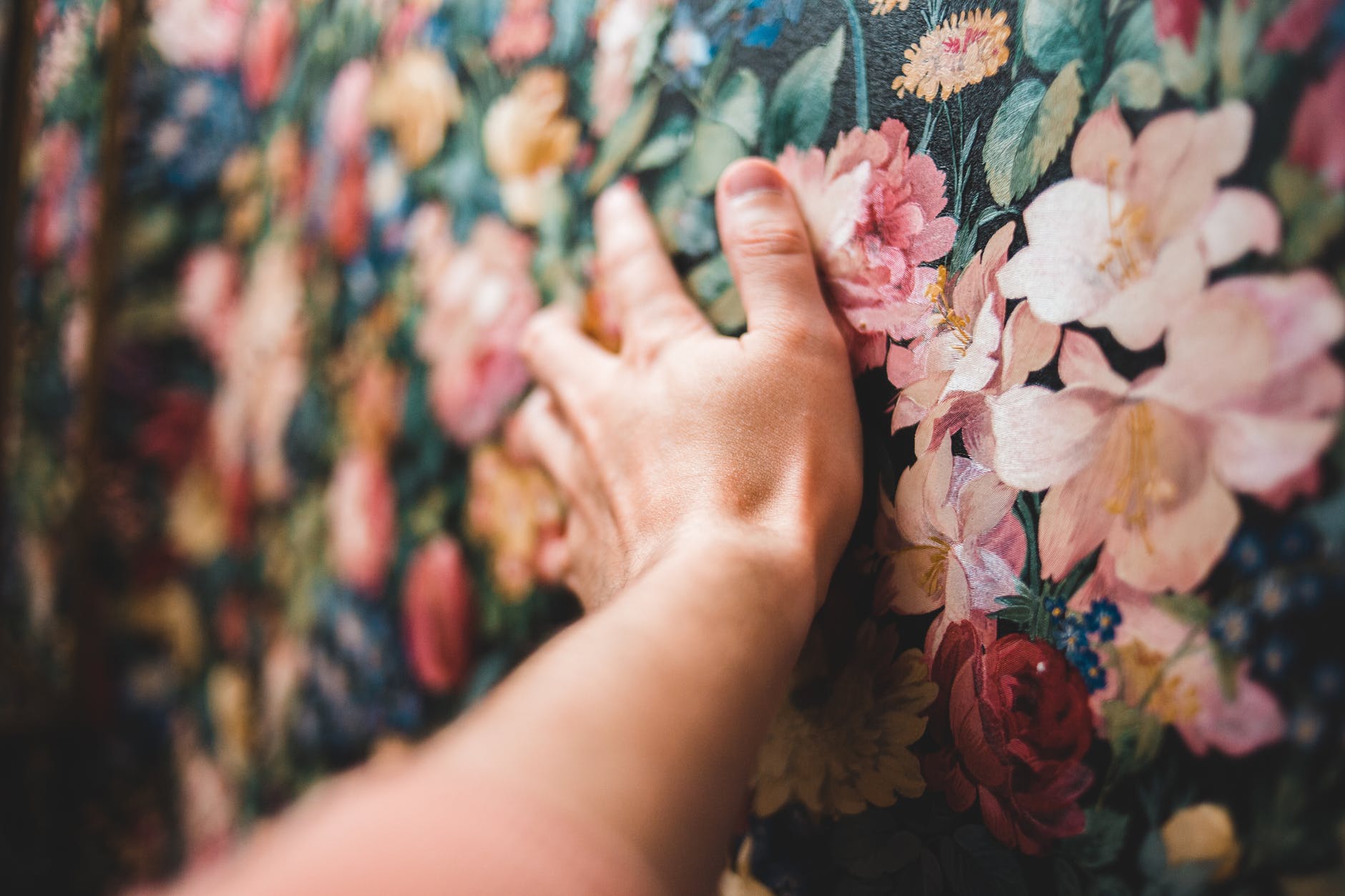
Visual Effects

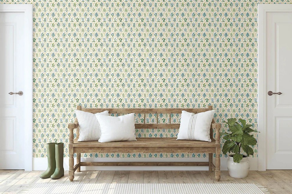
The stencil pattern shown above is the inspiration for our living room. We designed and built a fireplace that will look stunning with this color and pattern. This design will create a big, beautiful first impression when entering our home. It will draw the eye forward, making the room appear larger.
By using the lines in a room, such as furniture, textiles or wallpaper, you can create optical illusions that trick the eye and have the effect of enlarging or shrinking, emphasizing or minimizing. Consider the following to play up or tone down a part of your space:
- The width and direction of the lines of the wallpaper or stencil.
- The size of the pattern.
- The choice of light or dark colors.
Pattern
My approach to mixing patterns will help you create a cohesive look every time. You start by identifying surfaces that can contain a pattern, e.g., walls, rugs, upholstery, decorative pillows, lampshades, etc. To successfully combine patterns, consider irregular, organic and large patterns set side by side with more formal, austere and repeating patterns. When done correctly these patterns will lift and reinforce each other. You will want to select two or three of the following categories:
- Organic (Foliage, Flowers, Irregular patterns with birds and animals, Toile, Paisley)
- Geometric/Formal (Geometrical shapes, Stripes, Checks, Houndstooth)
- Color Blocking
You will also want to vary the pattern size, mixing smaller and larger patterns to create interest. Using areas of solid color helps balance your space so it feels harmonious. Consider letting a big pattern become center stage and give supporting parts to other patterned elements in your space. Finally, be sure to spread your chosen patterns throughout the room to create balance and visual flow.
Tips and Tricks
I recommend that beginners use the same base color for mixing patterns. This tip will ensure a calming and softer result instead of high contrast. Get samples and check them in your space before making a commitment. It is important to note the three types of pattern repeats, and how they affect the appearance and how much wallpaper is wasted:
- Straight-across match: The pattern matches across width of roll.
- Drop match: The pattern is offset to create variation.
- Random match: There is no need to match a pattern from one roll to the next.
There is an enormous range of colors and patterns to found in wallpaper and stencils. Tons of options that help give your walls structure, both visually and physically, including linen-like options and tactile finishes such as seagrass wallpaper. Whether you decide to go bold or Zen, I hope you have fun!
We will be completing our stenciled wall in the near future, so subscribe below to see the final result and to ensure you never miss a design tip.
